Data processing
For my work i work with genomic data and one tool i enjoy using is Roary. Roary is a orthologous gene clustering tool that uses BLAST to find similar genes, and if their similarity is above a threshold it would consider them being orthologous. In my case i normally stick to a 90% cutoff.
The output of roary is a huge excell sheet with genes and it also gives some plots about the amount of unique genes per genome, amount of new genes the genome adds to the total pool, and some other stats. The problem is that it’s not outputted in a way users can easily understand, they randomly sample the datasets so their data works as some generic output, but is totally uninformative. So here we’ll convert Roary to a nice looking plot, and also output some summary stats.
First off we’ll load our randomly stolen packages found on stackoverflow that is slightly changed to my liking. (If this is based on your code, please send me the stackoverflow link and i’ll add it)
detachAllPackages <- function() {
  basic.packages <- c("package:stats","package:graphics","package:grDevices","package:utils","package:datasets","package:methods","package:base")
  package.list <- search()[ifelse(unlist(gregexpr("package:",search()))==1,TRUE,FALSE)]
  package.list <- setdiff(package.list,basic.packages)
  if (length(package.list)>0)  for (package in package.list) detach(package, character.only=TRUE)
}

detachAllPackages()

install_load <- function(Required_Packages) {
  for(package in Required_Packages){
    if (!package %in% installed.packages()) install.packages(package, character.only = TRUE)
    library(package, character.only = TRUE)
  }
}
We’ll use a number of packages for this project. We need gplots for our plots, colorspace for some color changes and dplyr for some data manipulations.
Now we’ll load the data and convert it into a data frame
table_input <- read.csv("Roary_gene_presence_absence.csv", sep=",", na.strings=c("","NA"))
table_input <- as.data.frame(table_input)
The ouput of Roary looks like this, with p1 being our first actually datapoint.
Because Roary outputs a lot of data as you can see below, we’ll omit most of it, and only focus on the absence/presence matrix part of it.
table_values <- within(table_input, rm("Gene","Non.unique.Gene.name","No..isolates","No..sequences","Avg.sequences.per.isolate","Genome.Fragment","Order.within.Fragment","Accessory.Fragment","Accessory.Order.with.Fragment","QC","Min.group.size.nuc","Max.group.size.nuc","Avg.group.size.nuc"))Now we don’t need the data.frame portion anymore, we’ll convert the data to a matrix as this makes plotting easier and we’ll change the absence/presence matrix to a binary matrix.
abscence_presence <- as.matrix(table_values[,-1])
rownames(abscence_presence) <- table_values[,1]
abscence_presence[is.na(abscence_presence)] <- 0
abscence_presence[which(abscence_presence!=0)] <- 1
For some magical R reason some values aren’t numerical… instead of figuring out the reason, i’ll just go ahead and use mapply to convert each value in our binary matrix to a numeric value.
a_p_matrix <- mapply(abscence_presence, FUN=as.numeric)
a_p_matrix <- matrix(data=a_p_matrix, ncol=length(colnames(abscence_presence)), nrow=length(row.names(abscence_presence)))
row.names(a_p_matrix) <- row.names(abscence_presence)
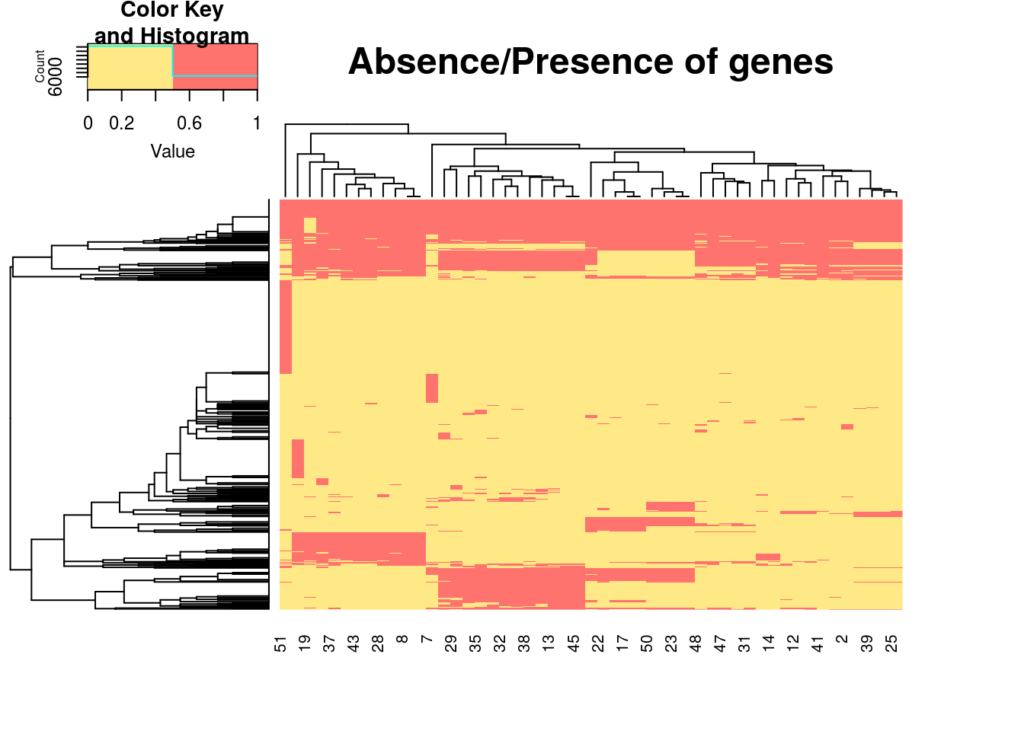
colnames(a_p_matrix) <- colnames(abscence_presence)Now we have a nice binary matrix to work from. Using heatmap.2 we can nicely plot this table into a heatmap, and let the the function cluster similar paterns together so we won’t have to. And we’ll use labRow=FALSE to supress all row labels as there are +/- 600 genes, so not really informative for this example.
heatmap.2(a_p_matrix, col = c("#FFE986","#FF736E"), main = "Absence/Presence of genes", trace="none", labRow=FALSE)
Now that we have our nice heatmap, we also want some of that sweet sweet summary data. We’ll add the total number of dataset analyzed as we’ll be using it a couple times further on.
genomes_count <- length(colnames(a_p_matrix))How we’ll do this is by adding a summary column at the end… In this example all the othrlog groups are on the rows, so this way we can easily calculate how many genomes have gene X, by just summarizing the binary matrix into this column.
abscence_presence <- cbind(a_p_matrix, rowSums(a_p_matrix))Now to not further tamper with our matrix, we’ll create a new matrix, that has three columns per dataset, one for total amount of genes that dataset has, one for the total amount of unique genes that dataset has, and one that will see how many genes are present in the majority of the strains based on some hardcoded cuttoff which we’ll get to later.
summary_table <- matrix(data=NA, nrow=3, ncol=length(colnames(abscence_presence)))
colnames(summary_table) <- colnames(abscence_presence)
rownames(summary_table) <- c("Total_genes","Unique_genes","Core_genes")
We’ll first calculate the sum of all columns in our absence presence matrix, this will give us the “total genes” per dataset.
summary_table[1,] <- colSums(abscence_presence)Based on the values in our summary column we can now subset our data and only grab the “unique genes” based on groups that only have 1 in the summary.
summary_table[2,] <- colSums(abscence_presence[which(abscence_presence[,ncol(abscence_presence)] == 1),])We can subset our data to extract the “CORE genes” by taking all the rows containing more than 1 and applying some cuttoff. In this case we’ll go with 0.95 (95%) of genomes_count (total), i.e. 95% of the total datasets have to have this gene to consider it a “CORE gene”.
summary_table[3,] <- colSums(abscence_presence[which(abscence_presence[,ncol(abscence_presence)] >= (genomes_count*0.95)),])This code was a bit sloppy in that it also analyzed the summary column and stored that in our summary table. This column doesn’t contain usable data, so we’ll just remove it
summary_table <- summary_table[,-ncol(summary_table)]No that we have all these stats, we’ll do some other stats as well that are more about the whole Roary analysis and less about individual datasets. We’ll call it average_table.
average_table <- data.frame(x=1:6, y=1:6, z=1:6)We will calculate some stats such as total genes analyzed, total orthologous groups, average gene count per dataset, average core genes, average unique genes and total unique genes. We could add more by simply performing some calculations over our summary_table and absence_presence matrix.
average_table[,1] <- c("Total genes analyzed","Orthologous groups","Average gene count","Average core genes","Average unique genes","Total unique genes")
average_table[1,2] <- sum(summary_table[1,])
average_table[2,2] <- length(rownames(abscence_presence))
average_table[3,2] <- median(summary_table[1,])
average_table[4,2] <- length(rownames(abscence_presence[which(abscence_presence[,ncol(abscence_presence)] >= (genomes_count*0.95)),]))
average_table[5,2] <- round(length(rownames(abscence_presence[which(abscence_presence[,ncol(abscence_presence)] == 1),]))/length(colnames(abscence_presence)))
average_table[6,2] <- length(rownames(abscence_presence[which(abscence_presence[,ncol(abscence_presence)] == 1),]))
Now ggplot doesn’t enjoy regular square matrixes as much as it likes long form matrixes, so we’ll use melt from reshape2 and while we’re at it we’ll plot the data using ggplot2, and we’ll use grid and gridExtra to put several of the plots into one graphical device.
Now we can use melt on the summary table, and we’ll order the plots from highest amount of genes to lowest
melt_summary_table <- melt(summary_table)
melt_summary_table <- melt_summary_table[order(melt_summary_table$value),]
First plot is the plot for total_genes per genome, total unique genes per genome and total “core” genes per genome. It’s a flipped bar chart, if you want anything else just change geom_bar into geom_line or geom_anythingelse
p1 <- ggplot(melt_summary_table, aes(x = reorder(Var2, value), y = value)) +
          geom_bar( stat = 'identity') +
          facet_grid(. ~ Var1, scales = "free_x") +
          xlab("Genomes") +
          ylab("Count") +
          coord_flip()
Second plot is for the “averages” so it shows average number of genes, average number of unique genes, and average number of core genes. Could be handy for outliers, shows how much each dataset deviates from the norm
p2 <- ggplot(data=average_table[-c(1,2,6),], aes(x=x, y=y))+
          geom_bar(stat = 'identity') +
          theme (axis.text.x=element_text(angle=90,hjust=1,vjust=0.3),
          axis.title.x = element_blank()) +
          geom_text(aes(y = 10, label = paste("N =" ,y),vjust = 0), colour = "white", show.legend=FALSE) +
          ylab("Count")
And a little text box giving some Roary output information such as total numer of datasets, total number of genes etc.
t1  <- textGrob(paste(c("Total number of genomes:\n",
                        length(colnames(summary_table)),
                        "\n\nNumber of analyzed genes:\n",
                        as.numeric(average_table[1,2]),
                        "\n\nTotal orthologous groups\n",
                        as.numeric(average_table[2,2]),
                        "\n\nTotal unique genes\n",
                        as.numeric(average_table[6,2])), collapse = " "))
## text[GRID.text.148]Now we have our plots stored in p1, p2 and t1, we’ll have to figure out how we want to show it. The biggest plot is the p1 plot as it has 3 types of information for all dataset, so essentially 3 plots into on. The p2 plot is a small plot consists of a single barchart that only has a couple values, and the t1 textbox only has 8 lines of text. We’ll use rbind to make a matrix that shows how much space each plot gest
lay <- rbind(c(1,1,2),
             c(1,1,2),
             c(1,1,3),
             c(1,1,3))
And now all that is left is plotting it.
grid.arrange(p1,p2,t1, layout_matrix = lay)
Thank you for flying Lesley Airlines!
To make your life easier, the full script is available on my github
https://github.com/IamIamI/pADAP_project/tree/master/Roary_stats
This is part of our publication titled “Evolution of virulence in a novel family of transmissible mega-plasmids” https://doi.org/10.1111/1462-2920.15595, we would appreciate it if you cite us if you ended up using this approach, but no pressure off course😃
Excelent tutorial! Work perfect!
Awesome 😀 and additionally, the output is in pdf, therefore everything in the PDF are vectors that you can edit with tools like InkScape, CorelDraw, Adobe Illustrator… that way you can easily highlight labels, removes axis, change colors etc if it’s too hard to do through R 😀
Really fantastic! Thanks for sharing!
Can someone show its demo? How we run these commands in terminal?
Hey Shahida,
At the moment this script is only really tested in RStudio as a script.
I do have it as a script ready to go as well on Github.
The problem is that the input file is hardcoded atm, so the roary output file has to be in the same folder as where you run the script.
And there might still be bugs that aren’t apparent from running it in RStudio.
Alternatively if you are on your terminal, you can just type
Rand follow the steps block by block that way it’s easier to figure out if and where things might go wrong 😀Hi Lesley,
Thank you so much for such a detailed tutorial. People like you truly make a difference when it comes to the reproducibility of science.
I was wondering if I could export a list of core genes from either the summary_table or the presence_absence object. I tried to do it myself, but no luck yet.
Thanks!
Unfortunately not, the summary table should only be a numerical matrix if i’m not mistaken.
But that matrix is build by subsetting the initial data.frame so we can just break down those command to get what you want.
The line of code that calculates the unique genes is this one
summary_table[2,] <- colSums(abscence_presence[which(abscence_presence[,ncol(abscence_presence)] == 1),])So instead of storing it as a summary of colums, we could just store it into a variable
unique_genes <- abscence_presence[which(abscence_presence[,ncol(abscence_presence)] == 1),]And then for the core we can again use part of the original colde
summary_table[3,] <- colSums(abscence_presence[which(abscence_presence[,ncol(abscence_presence)] >= (genomes_count*0.95)),])And subset that into the following
core_genes <- abscence_presence[which(abscence_presence[,ncol(abscence_presence)] >= (genomes_count*0.95)),]I think that should sorta be what you want? Off course you can add more definitions, Roary itself has numerous layers like “shell” and “core shell” which is >80% and >95-99% or something like that…
And then you can either combine them into a new frame with rbind, or you can just save them seperately using write.csv or something 😀
Hope it helps!
Thank you for taking the time! It is not exactly what I was looking for, but it does help. I was looking for a list that I can match with the individual gene alignments, which are named something along the lines of .aln.fas.
Hi Lesley!
Great tutorial, however I’m a bit stuck at the heatmap… I have 250 genomes with around 50.000 genes in total so it is loading forever. Even after letting my laptop run it overnight, there is still nothing there and it didnt look like it was doing anything. Do you have any tips on this or is the dataset simply too large for this to work?
Thanks,
Nina
Heya, yeah i think that is just too much to visualize… there is also the hierarchical clustering aspect of it that it does on the gene side.
What we normally do in such a case is take a subset of genes that are of interest by subsetting roary table, for example pathogenic genes (which is often only 10-100).
Also at that resolution with 50K labels on the x-axis and 200 labels on the y-axis, you’ll end up with a >200mb pdf probably and you wont be able to see the forest through the trees anymore.
If you want i could probably create a separate version that creates seperate plots for genes shared among all, singletons, etc etc, that might reduce the load maybe. But my case was 100 genomes, 1.5K genes… so significantly smaller than your case.
Hi Lesley! That’s not necessary, but thank you 🙂 I decided to just plot the core and accessory genes and leave out everything that is present in less than 15% – that should reduce the load significantly.
Another question though, is there a way to flip the heatmap so that the name of the organism is shown vertically and the genes clustering horizontally? Sorry if this is a stupidly easy question, I’m just starting to learn R 😀
Thanks again,
Nina
Thank you for this awesome tutorial!!!
Wow, This is incredible! Thanks for sharing
Hello, I tried
p1 <- ggplot(melt_summary_table, aes(x = reorder(Var2, value), y = value)) +
geom_bar( stat = 'identity') +
facet_grid(. ~ Var1, scales = "free_x") +
xlab("Genomes") +
ylab("Count") +
coord_flip()
However, I could not see any plot generated for p1 or p2. What could be the reason.
Ah yes, the normal behavior of R is that <- signifies that you are trying to direct/store content into whatever is left of the arrow. So your plot is stored in variable p1 To show the plot all you have to do is just write
p1That should now run the content (which is ggplot etc etc) and produce the plot.
Hello, while running this ggplot
p1 <- ggplot(melt_summary_table, aes(x = reorder(Var2, value), y = value)) +
geom_bar( stat = 'identity') +
facet_grid(. ~ Var1, scales = "free_x") +
xlab("Genomes") +
ylab("Count") +
coord_flip()
i am getting an Error
Error in `combine_vars()`:
! At least one layer must contain all faceting variables: `Var1`
✖ Plot is missing `Var1`
✖ Layer 1 is missing `Var1`
for the ggplot function.
Have you faced this, can u tell me what can be done to fix this.?
Good day,
It’s been a loooong time since i touched this, but Var1 Var2 would normally point to the column name. Normally when you generate a data.frame it would give you new columnnames that are Var1-N.
But maybe this naming system has changed, or you labeled your columns yourself.
Easy fix is running
colnames(melt_summary_table)[2]and replace Var2 with that. Then runcolnames(melt_summary_table)[1]and use the name you get for that instead of Var1Potentially you could even cheat around this and just do something hacky… but it seems they pretty much deprecated all ways of using a numerical pointer now… so you will likely get a warning running the code below, and might not even work at all since the way facet_grid is referencing the data .~Var2 is also not considered good practice anymore i believe.
p1 <- ggplot(melt_summary_table, aes_string(x = names(melt_summary_table)[2], value), y = value)) +
geom_bar( stat = 'identity') +
facet_grid(. ~ names(melt_summary_table)[1], scales = "free_x") +
xlab("Genomes") +
ylab("Count") +
coord_flip()