Data input and processing
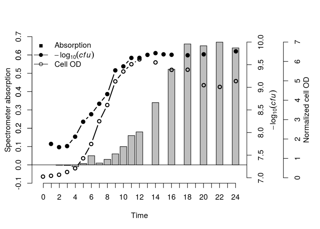
This one was a confusing one. Technically putting three different types of data in a comparable plot makes hardly any sense. But my colleague wanted to show that cell growth both in OD and plate counts correlated to protein secretion. This does make sense because they are all correlated data, but the values don’t match. So let’s get into it.
We started off with three data sets. A corrected OD table (this could work with raw OD600nm values as wel), averaged plated counts and protein secretion based on a bredford assay she developed (this method changes color based on protein secretion, and can be analyzed in a spectrometer). To be honest, the data doesn’t matter, any type of data will work.
table_input1 <- read.table("CFU.csv",header=TRUE,sep=",",
                           na.strings="NA",dec=".",
                           strip.white=TRUE)
table_input2 <- read.table("Protein.csv",header=TRUE,sep=",",
                           na.strings="NA",dec=".",
                           strip.white=TRUE)
table_input3 <- read.table("Plate_count.csv",header=TRUE, sep=",",
                           na.strings="NA", dec=".",
                           strip.white=TRUE)
The data looks as followed
| OD | Plate | Protein | ||||||||
|---|---|---|---|---|---|---|---|---|---|---|
| Time | Mean | Stdev | Time | Mean | Stdev | Time | Mean | Stdev | ||
| - | 0 | 0.06 | 0 | - | ||||||
| 1 | 5.5e^6 | 1e^3 | 1 | 0.1 | 0.005 | - | ||||
| 2 | 4.5e^7 | 7e^4 | 2 | 0.15 | 0.01 | 2 | -0.002 | 0.007 | ||
| ... | ... | ... | ||||||||
| 24 | 6e^9 | 4E+06 | 24 | 5 | 0.35 | 24 | 0.6 | 0.04 |
As our OD measurements contain values going up to e^9, we’ll put it on a Log10 scale so it’ll be possible to put it in the same space as the values of the other tables.
table_input1$Mean <- log10(table_input1$Mean)And then we’ll merge all our tables based on similar “Time” values. All missing sample points will be replaces with NA values
new_table_input <- merge(table_input1, table_input2, by="Time", all=TRUE, incomparables=NULL)
new_table_input <- merge(new_table_input, table_input3, by="Time", all=TRUE, incomparables=NULL)
Now that all three of our datatables are merged the data looks like this.
##   Time   Mean.x  Stdev.x       Mean.y     Stdev.y      Mean       Stdev
## 1    0       NA       NA           NA          NA 0.0600000 0.000000000
## 2    1 7.748188 12453112           NA          NA 0.1016667 0.007767453
## 3    2 7.676694  6843975 -0.001987000 0.006784541 0.1543333 0.010016653
## 4    3 7.699549 17067318 -0.002953833 0.001738491 0.2963333 0.009237604
## 5    4 7.908306 27401521 -0.010000000 0.000000000 0.4883333 0.044814432
##Plotting the data
We have to start off with making restrusturing our graphical device settings. We’ll remove the default, and place a partitioned window partitions in which we can plot all the individual axis. You can change the values to give certain axis a little more space, or you can add even more seprators if you want to make a 16, 32, 64 on infitite axis plot.
dev.off()
par(mar=c(5, 3.5, 4, 8))
## null device
## 1Now that the graphical device is set, we can plot the first data, the protein concentrations based on OD values. We’ll add these as a normal bar chart. But this can easily be changed into a line chart or anything else.
ymax <- round(max(new_table_input$Mean.y, na.rm=TRUE), digits=1)# Y-max value
ymin <- -0.1# Y-min value
m <- barplot(new_table_input$Mean.y, xpd=FALSE, ylim=c(ymin,ymax), xlab="Time", ylab="", col="gray")
mtext(expression("Spectrometer absorption"), side=2, line=2, col="black")
axis(side=2, ylim=c(ymin,ymax), col="black", col.axis="black", at=seq(-0.1,0.7,0.1))
axis(side=1, at=m, labels=new_table_input$Time) # <-- plot the Y-axis for the boxplot with the time labels instead of actual x-axis coordinates, this is to prevent labels from missing (as not all data had samples at the same timepoints)
abline(h=0) # <- i added a horizontal line to determine the negative values, spectrometer corrects values to negatives based on blanks. 
Owhkee, so far so good. The trick is to now overlay a transparant graphical device so that our previous one doesn’t get overwritten, and as long as we keep all the partitions the same and stay on the same x-axis scale it should work just fine.
par(new=T) # <-- plot a transparant new windowNow for the second plot, we are adding the CFU counts based on OD. We’ll add this as a line chart going over points. This will show both the missing data points and still gives us a trendline.
ymax <- ceiling(max(new_table_input$Mean.x, na.rm=TRUE))# Y-max value
ymin <- floor(min(new_table_input$Mean.x, na.rm=TRUE))# Y-min value
plot(m, ylim=c(ymin,ymax), axes=F, type="n", xlab="", ylab="") # <- plot new empty window, with the new y-axis values
# Calculate where X-axis starts, ends, and where the individual points are
xlims <- par('usr')[1:2] # <-- get Where the window of the plot starts and ends
xoffset <- par('plt')[4] # <-- get the offeset between the window and the actual start and end of the x-axis
x_intervals <- ((xlims[2]-xoffset)-(xlims[1]+xoffset))/length(new_table_input$Mean.x) # <-- calculate the step size
x_start <- xlims[1]+xoffset+(0.5*x_intervals) # <-- calculate the true x = 0 point
x_end <- xlims[2]-xoffset+(0.5*x_intervals) # <-- calculate the true x=24 point
# Create the X-ticks
new_x_axis <- seq(x_start,x_end,x_intervals)
# Plot the line, add the lext to y-axis, plot y-axis
lines(x=head(new_x_axis, -1), y=new_table_input$Mean.x, type="b",pch=19,lwd=2, ylim=c(ymin,ymax), col="black") # <-- plot the line of data type 2
mtext(expression(-log[10](italic(cfu))), side=4, line=2.5, col="black")
axis(side=4, col="black", col.axis="black")
For the final dataset we’ll just repeat the previous step. Create a transparant partitioned graphic device, extract the window sizes of the partitioned device, plot the appropriated data in the appropriate windows and it’s done.
par(new=T) # <-- plot a transparant new window
ymax <- ceiling(max(new_table_input$Mean, na.rm=TRUE))# Y-max value
ymin <- floor(min(new_table_input$Mean, na.rm=TRUE))# Y-min value
plot(m, ylim=c(ymin,ymax), axes=F, type="n", xlab="", ylab="") # <- plot new empty window, with the new y-axis values
# Calculate where X-axis starts, ends, and where the individual points are
xlims <- par('usr')[1:2] # <-- get Where the window of the plot starts and ends
xoffset <- par('plt')[4] # <-- get the offeset between the window and the actual start and end of the x-axis
x_intervals <- ((xlims[2]-xoffset)-(xlims[1]+xoffset))/length(new_table_input$Mean.x) # <-- calculate the step size
x_start <- xlims[1]+xoffset+(0.5*x_intervals) # <-- calculate the true x = 0 point
x_end <- xlims[2]-xoffset+(0.5*x_intervals) # <-- calculate the true x=24 point
# Create the X-ticks
new_x_axis <- seq(x_start,x_end,x_intervals)
# Plot the line, add the lext to y-axis, plot y-axis
lines(x=head(new_x_axis, -1), y=new_table_input$Mean, type="b",pch=21,lwd=2, ylim=c(ymin,ymax), col="black") # <-- plot the line of data type 2
mtext(expression("Normalized cell OD"),side=4,line=6, col="black")
axis(side=4, line=4, col="black", col.axis="black")
legend("topleft",legend=c("Absorption", expression(-log[10](italic(cfu))), "Cell OD"), lty=c(0,1,1), pch=c(15 ,19, 21), col=c("black", "black", "black"), bty = "n")
We can change y-axis etc to get everything looking a little more centered. But seeing as we have negative values it’s even harder to get them on the same plane. This is why multi axis data is probably not the best way to go. But it is possible!